Category: Media. Tags: Leaderboards and standings, Social and audience, Offices and workplaces.
Previews
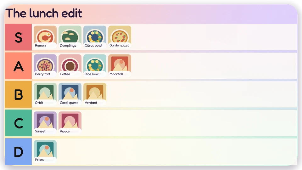
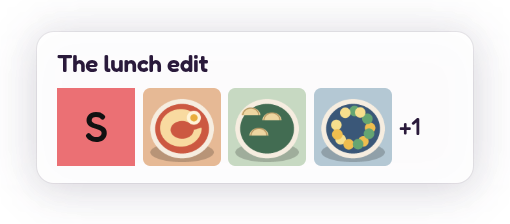
Views and forms
Views: canvas, corner, chip. Canvas forms: landscape, portrait, square, strip.
Card views, themes and publishing. Browse the gallery.
Data and privacy
This card uses its configured properties and live card data.
Properties
For theme, background, accent and position, see Common properties.
Set static properties in params. Bind data to a project card data key for live values; that document holds only dynamic properties. Without a data key, put the complete configuration in params. Nested rows describe the contents of their parent property.
Static properties
| Name | Type | Default | Values and limits | Description |
|---|---|---|---|---|
title | string | "Tier list" | maxLength: 80 | |
tiers | array | [{"label":"S"},{"label":"A"},{"label":"B"},{"label":"C"},{"label":"D"}] | minItems: 2; maxItems: 8 | Tiers in rank order. Labels are unique; an optional colour overrides the theme ramp. |
tiers[].label | string | minLength: 1; maxLength: 12; Required | ||
tiers[].color | string | pattern: "^#[0-9A-Fa-f]{6}$" | ||
showCaptions | boolean | true |
Dynamic properties
| Name | Type | Default | Values and limits | Description |
|---|---|---|---|---|
items | array | [] | maxItems: 120 | Images in rank order within each tier. IDs are stable and unique. Unknown tiers are ignored. |
items[].id | string | minLength: 1; maxLength: 80; Required | ||
items[].tier | string | minLength: 1; maxLength: 12; Required | ||
items[].image | string | maxLength: 256; Required | Project media reference (media:<id>); fixtures use original local artwork. | |
items[].caption | string | "" | maxLength: 160 |
Canvas example
Add this item to a playlist page’s primitives. Publish the playlist and assign a screen.
{
  "id": "tier-list",
  "primitive": "card",
  "card": "tier-list",
  "major": 1,
  "params": {
    "theme": "neomustard"
  },
  "rect": {
    "x": 0,
    "y": 0,
    "width": 1920,
    "height": 1080
  },
  "layer": 0,
  "content_fit": "fill",
  "data": "example-key"
}
Write live data
The canvas example binds its data field to example-key. That value is a data key: a name this canvas item chooses, not the name of the card. Give each canvas item its own key when items should show different data, or share one key when they should show the same data. Keys are scoped to the project, follow the K/V key grammar, and cannot start with feed:.
Create this document before showing the card, then replace it to update the screen without republishing. Writes to a key that live canvas items bind are checked against each bound card’s dynamic properties. Use the same project as the playlist.
Save the document as card-data.json. The CLI reads the document itself, with no wrapper:
{
  "items": []
}
screenrig card-data put example-key --file card-data.jsonOr call the API directly. The API wraps the same document in a document field. An agent token already names its project, so no project header is sent; if you send ScreenRig-Project, it must match the token’s project. Supply your API authorization through the environment; see API authentication.
curl --request PUT "https://api.screenrig.ai/api/card-data/example-key" \
  --header "Authorization: Bearer $SCREENRIG_TOKEN" \
  --header "Content-Type: application/json" \
  --data '{"document":{"items":[]}}'