Logos and wordmarks
The wordmark and the square logomark each come in colour, white and black, as vector masters and ready-made rasters. Take the one that matches your ground.
WordmarkDark ground



Wordmark, whiteDark photo or fill


Wordmark, blackLight ground


LogomarkAny ground



Logomark, whiteDark ground



Logomark, blackLight ground



Spell it screenRIG
Lowercase screen, uppercase RIG, one word, in running text and in the wordmark. Case, not colour, separates the two halves, so the name reads the same in one colour.
Pick the master for the ground
Dark grounds take the colour wordmark: amber screen, white RIG. Light grounds take the black master, both halves in ink. Single-colour uses take the white or black master.
Keep the logomark whole
The frame, the sloping inner corner and the two eyes are one unit. The mark carries no text. Place the wordmark beside it, never inside it.
Change nothing
Keep the supplied colours, proportions and drawing. Add no pedestal, sparkle, shadow, gradient, outline or glow, and do not stretch, rotate or recolour either mark.
Use the supplied rasters
The wordmark SVG names Agave but does not embed it. Use the PNG or WebP files, which are trimmed with an even pad, for print, slides and partner pages, and do not re-render the SVG without the font.
Keep it legible
Give each mark room on every side, keep it large enough to read, and put it on a ground it contrasts with. The wordmark stays at the top left of a page and links home.
Animated logo
The logomark wakes up. A scanline powers the screen on and splits into two eyes, the agent looks around, spots the viewer, smiles and settles exactly on the logomark.
Agent eyesPlays once

- Animated SVG: self-contained, plays once and holds; reduced motion shows the static logomark. Download SVG
- Lottie JSON: vector at any size for web and native apps. Download JSON
- Startup film, MP4: 1024 by 1024, 60 fps, 7 seconds, silent, on the ground colour. Download MP4
- Share cut, MP4: 1920 by 1080, 9 seconds: the same film, then the wordmark lands and the agent blinks. For Slack, social, decks and email. Download MP4
- Transparent WebM: the film with alpha outside the mark, for compositing in video edits. Download WebM
Players paint the ground colour #2A3547 behind the film, and the film uses the same colour, so it sits on a Player screen without a visible square.
App icons
One icon family for every store and system: the logomark on the amber and slate colours, with no text. Each set follows its platform's conventions, so copy a set in as it is.
Icon family
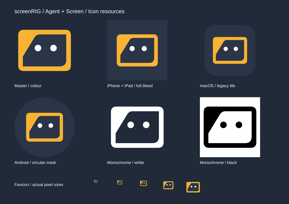
| Platform | Included | Download |
|---|---|---|
| Web and browser | Favicon SVG and ICO, PNG 16, 32 and 48, Apple touch icons, and standard and maskable 192 and 512 web app icons. | Web icons (ZIP) |
| Android and Android TV | Adaptive foreground and background, Android 13 monochrome layer, round and standard launchers from mdpi to xxxhdpi, 512 pixel Google Play artwork and the TV banner. | Android icons (ZIP) |
| iPhone, iPad, macOS and Apple TV | iOS and iPadOS app icon sets with the 1024 pixel App Store icon, single-size dark and tinted sets, the macOS icon set and ICNS, layered Apple TV icons and top shelf art, and vector layers for Icon Composer. | Apple icons (ZIP) |
| Windows | Multi-size ICO and MSIX logo and tile assets at every scale. | Windows icons (ZIP) |
| Linux and Raspberry Pi | Scalable SVG and PNG 16 to 1024 in the hicolor layout, named ai.screenrig.player. | Linux icons (ZIP) |
Colour codes
Twelve colours make the whole palette. The ground is most of any screen, and colour names a state instead of decorating a surface. Amber is the accent.
Ground
#2A3547 · rgb(42 53 71)
--ground
Page background. Most of any screen is ground.
Surface
#3D4B5F · rgb(61 75 95)
--surface
Cards, panels and raised rows.
Well
#202A38 · rgb(32 42 56)
--well
Recessed areas: code, terminal output, inputs.
Body text
#D3D8E0 · rgb(211 216 224)
--fg
Body copy. Passes AA on ground and surface.
Bright
#FFFFFF · rgb(255 255 255)
--fg-bright
Headlines and RIG. The loudest thing in a block.
Muted
#9CA3AF · rgb(156 163 175)
--fg-muted
Secondary text and captions, on the ground only.
Brand amber
#F8B334 · rgb(248 179 52)
--amber
screen in the wordmark, links, focus rings and the one primary action.
Primary blue
#3F70B7 · rgb(63 112 183)
--blue
Fill only: selected states, filled controls, chart series. Never text or lines.
Error ember
#E6664D · rgb(230 102 77)
--error
Error level and failure.
Alert copper
#DF7F2A · rgb(223 127 42)
--alert
Alert level and caution. Not brand amber.
Info steel
#6B9BBC · rgb(107 155 188)
--info
Info level and notice. Not primary blue.
Success green
#3FAE6A · rgb(63 174 106)
--success
A genuine success state only.
Two rules to keep
- Primary blue is a fill, never ink. White text on blue passes at 4.98 : 1. Blue as text, a link, a border or an icon stroke fails on both grounds.
- Muted text stays on the ground. Inside a card, secondary text uses body text
#D3D8E0. - Lines are never grey. Draw each line as the body text colour at a low alpha over the ground.
| Colour | On ground | On surface |
|---|---|---|
Body text #D3D8E0 | 8.64 : 1 | 6.19 : 1 |
Bright #FFFFFF | 12.36 : 1 | 8.86 : 1 |
Muted #9CA3AF | 4.87 : 1 | 3.49 : 1, fails |
Brand amber #F8B334 | 6.76 : 1 | 4.85 : 1 |
Primary blue #3F70B7 | 2.48 : 1, fails | 1.78 : 1, fails |
| Level | On ground | On cards |
|---|---|---|
| Error | #E6664D | #EA7D68 |
| Alert | #DF7F2A | #E4924A |
| Info | #6B9BBC | #81AAC6 |
Typography
screenRIG sets everything in Agave, a monospace face, so the type reads like a tool and commands, paths and identifiers look native. Two weights, regular and bold, are the whole system.
AgaveRegular and bold
Put your screens in the conversation.
Give your agent a screen.
abcdefghijklmnopqrstuvwxyz
abcdefghijklmnopqrstuvwxyz 0123456789 #2A3547
Download the font
- Agave Regular: TTF WOFF2
- Agave Bold: TTF WOFF2
- Both weights, TTF and WOFF2, with the licence: Font pack (ZIP)
- Licence: SIL Open Font License 1.1. Read the licence
Rules
- Self-host the font as WOFF2 with
font-display: swap, and never load it from a remote service. - Fall back to the local monospace face, so text stays visible if the font fails.
- Use weights 400 and 700 only, with no negative tracking.
- Capitals belong to the label voice, and are set with CSS rather than typed.
- Panels read across a room use a body size of at least 26 px, and nothing renders below 20 px.
| Role | Size and line | Weight | Use |
|---|---|---|---|
| Heading 1 | 64 / 72 px, 56 / 64 below 1280 px, 48 / 56 below 1024 px | Bold | Page titles. White, with the key phrase in amber. |
| Heading 2 | 32 / 40 px | Bold | Section headings in amber on marketing pages. |
| Body | 15 / 24 px | Regular | Everything else. The body size never changes. |
| Label | Body size, capitals, tracked +0.08em | Regular | Section bars, plate heads, table heads and kickers, in muted ink. |
| Tool text | 13 px body on a 1.45 line, 11 to 12 px captions | Regular | Dense tools and debug pages read at desk distance. |
Name and voice
screenRIG sounds direct, capable and concrete. It leads with the result and lets the agent absorb the operational complexity.
Product line
Signage and kiosk infrastructure for AI agents. Digital signage and kiosks carry equal weight, so name both together.
Promise
Put your screens in the conversation. The homepage headline is Give your agent a screen.
Boilerplate
screenRIG is signage and kiosk infrastructure for AI agents. Your agent publishes images, videos, streams, web pages, and applications to screens through the official plugin.
Lead with the outcome
Write Put this dashboard on the lobby display, or Set up this self-service check-in kiosk. Use the verbs pair, put, show, update, publish and verify.
Say what it is
State what screenRIG is and does, in present tense, with no availability caveats. The surface is a CLI-backed agent skill, installed as the official plugin.
Keep claims plain
Use agent-native instead of hype words. The claim is structural: the user is an AI agent. Quote prices exactly as the pricing page states them.
Press, partner and marketplace questions, and requests for a format this kit does not carry, go through the contact page.
Everything in one download
Take the logo pack, then add the icons and the font for the platform you build on.