Category: Retail. Tags: Stores, Prices and rates.
Previews
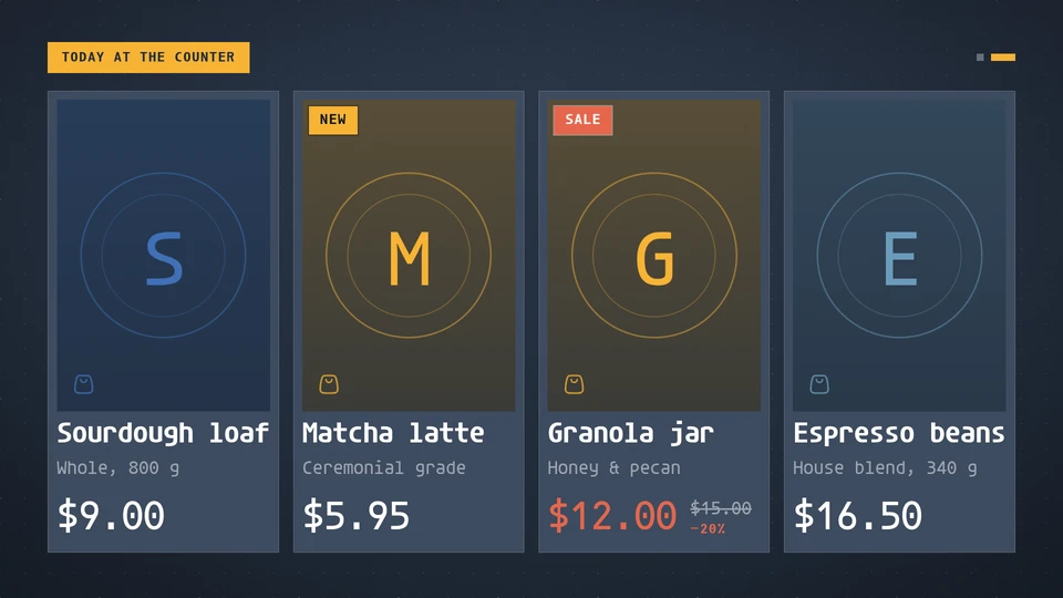
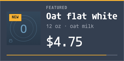

Views and forms
Views: canvas, corner, chip. Canvas forms: landscape, portrait, square, strip.
Card views, themes and publishing. Browse the gallery.
Data and privacy
This card uses its configured properties and live card data.
Properties
For theme, background, accent and position, see Common properties.
Set static properties in params. Bind data to a project card data key for live values; that document holds only dynamic properties. Without a data key, put the complete configuration in params. Nested rows describe the contents of their parent property.
Static properties
| Name | Type | Default | Values and limits | Description |
|---|---|---|---|---|
title | string | "Featured" | maxLength: 40 | |
currency | string | "$" | maxLength: 4 | Shown before every price. |
perPage | integer | 6 | minimum: 1; maximum: 8 | |
pageSeconds | integer | 10 | minimum: 5; maximum: 120 |
Dynamic properties
| Name | Type | Default | Values and limits | Description |
|---|---|---|---|---|
products | array | [] | minItems: 0; maxItems: 24 | Products in order. Pages hold perPage products, balanced, and turn every pageSeconds on the wall clock. |
products[].name | string | minLength: 1; maxLength: 60; Required | ||
products[].detail | string | "" | maxLength: 60 | A line under the name: size, origin, flavour. |
products[].price | number | minimum: 0; maximum: 1000000 | ||
products[].wasPrice | number | minimum: 0; maximum: 1000000 | The earlier price, shown struck through. Above price, it also marks the product as on sale. | |
products[].badge | string | "" | "", "new", "sale", "low-stock" | Empty marks nothing, except that a wasPrice above price reads as sale. |
products[].photo | string | "" | maxLength: 2048 | A project media reference (media:<id>) the host resolves; empty or failing shows a tile in the theme's colours with the product's initial. |
Canvas example
Add this item to a playlist page’s primitives. Publish the playlist and assign a screen.
{
  "id": "product-grid",
  "primitive": "card",
  "card": "product-grid",
  "major": 1,
  "params": {
    "theme": "neomustard"
  },
  "rect": {
    "x": 0,
    "y": 0,
    "width": 1920,
    "height": 1080
  },
  "layer": 0,
  "content_fit": "fill",
  "data": "product-grid-main"
}
Write live data
Create this document before showing the card, then replace it to update the screen without republishing. Use the same project as the playlist. Supply your API authorization through the environment; see API authentication.
curl --request PUT "https://api.screenrig.ai/api/card-data/product-grid-main" \
  --header "Authorization: Bearer $SCREENRIG_TOKEN" \
  --header "ScreenRig-Project: $SCREENRIG_PROJECT" \
  --header "Content-Type: application/json" \
  --data '{"document":{"products":[]}}'