Category: Time. Tags: Clocks and calendars, Offices and workplaces, Lobbies and reception, Stores.
Previews
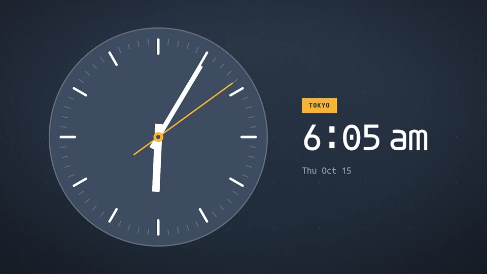
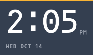

Views and forms
Views: canvas, corner, chip. Canvas forms: landscape, portrait, square, strip.
Card views, themes and publishing. Browse the gallery.
Data and privacy
This card uses its configured properties and live card data.
Properties
For theme, background, accent and position, see Common properties.
Set static properties in params. Bind data to a project card data key for live values; that document holds only dynamic properties. Without a data key, put the complete configuration in params. Nested rows describe the contents of their parent property.
Static properties
| Name | Type | Default | Values and limits | Description |
|---|---|---|---|---|
face | string | "digital" | "digital", "analog", "words", "flip", "sets", "rings", "ruler" | |
hour12 | boolean | false | ||
showSeconds | boolean | false | ||
showDate | boolean | true | ||
dateFormat | string | "long" | "long", "short", "numeric" | |
timeZone | string, null | null | IANA zone; null uses the screen's zone. | |
label | string | "" | maxLength: 40 |
Dynamic properties
This card has no dynamic properties.
Canvas example
Add this item to a playlist page’s primitives. Publish the playlist and assign a screen.
{
  "id": "clock",
  "primitive": "card",
  "card": "clock",
  "major": 1,
  "params": {
    "theme": "neomustard"
  },
  "rect": {
    "x": 0,
    "y": 0,
    "width": 1920,
    "height": 1080
  },
  "layer": 0,
  "content_fit": "fill"
}